Bathroom Brad - Brand Study
The Brief #
A full branding system for a bathroom remodeling company, from logo sketches to a working HTML/CSS design system ready to hand off to a developer.
Role: Brand Designer · Company: Bathroom Brad, bathroom remodeling services · Timeline: 2026 · Team: Solo · Platform: Print, digital, web · Tools: Figma, HTML/CSS, GitHub Pages · Status: Shipped, brand guidelines complete, design system live at jonmccon.github.io/brb-design-system
The brief was pretty tight: we need to be a real company. Not a generic contractor rebrand, not another pressure-washed logo with a wrench icon. Bathroom Brad had a personality and the brand needed to match it.
I started with the name. "Bathroom Brad" has a good rhythm to it, a little playful, a little direct. So I leaned into that: a strong monogram mark, a stamp treatment that could go on a van wrap or a business card, and a wordmark that reads clearly at any size.
The color system is more opinionated than you'd expect for the category. Primary orange, pink accent, mint green, and a slate blue. It holds up across print and screen and gives the brand room to be itself without feeling like it's trying too hard to be something it isn't.

Logo System #
The logo system is built around two marks: a B-stamp monogram and a badge with the full name. But they aren't meant to be prescriptive, more that each can be a smaller system unto themselves, and should respond to where they're used.
I went through a lot of iterations. Early sketches were rougher explorations of how to lock up "BATHROOM BRAD" as a single unit. The uppercase wordmark with tight tracking ended up being the right call, it reads like a brand name, not a description.
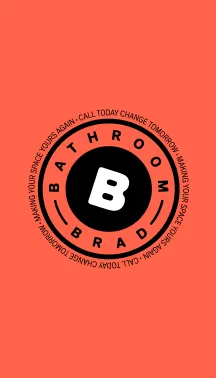
The badge is probably my favorite piece. The circular ring type runs the tagline "CALL TODAY CHANGE TOMORROW · MAKING YOUR SPACE YOURS AGAIN" around the B-stamp monogram. It's the kind of mark you could put on a work shirt or emboss on a box and it would still read clearly. There's also a short version of the wordmark that just says "BRAD" for smaller applications like stickers, uniform patches, that kind of thing.

Color & Typography #
The palette started with the orange, warm, visible, the kind of color that reads as confident without tipping into aggressive. From there I built out a full ramp and added the accent colors to give the system flexibility for UI work without requiring everyone to use orange for everything.
Typography is Hanken Grotesk paired with JetBrains Mono. Hanken handles everything from display down to body copy, extrabold headings, regular body text. JetBrains Mono handles the spec and data text, which shows up naturally in a remodeling context (dimensions, serial numbers, product specs). That pairing ended up informing the design system directly, the type tokens map straight into CSS variables.


Design System Handoff #
This is where it got interesting. Rather than hand off a PDF or a Figma link and call it done, I built the design system as a working HTML/CSS page, tokens, components, and all. It lives at jonmccon.github.io/brb-design-system and the source is on GitHub.
Every color has CSS custom properties. Every type size is a token. The button system covers filled, outline, ghost, pill, and disabled states across all the brand colors. It's the kind of thing you can actually fork and drop into a project rather than re-interpret from a static document.
The semantic token table is probably the most useful piece for a developer, it maps the named tokens to the actual color ramp values and documents their intended use.


Business Cards #
The business card system covers multiple stakeholders without requiring a full redesign for each person with the layout is fixed, the variables are name, title, and contact info. That kind of repeatability is what makes a brand system actually work for a small company.


What a Working Handoff Looks Like #
The HTML design system is the deliverable, not the Figma file. A lot of branding work ends at guidelines that live in a folder somewhere and never get opened again. Publishing it as a live page changes the dynamic it's linkable, it's updatable, it's already built.
The design challenges this format unlocks: tokens are testable before implementation, not just documented; button states are actually interactive (hover, disabled, active); typography samples render in the real font stack, not a screenshot; color previews are actual hex values with working swatches, not images.
That's what I want from a handoff. Something someone can actually use.
Reflection #
Small business branding projects are a good forcing function there's no big stakeholder meetings to defer decisions to. You just have to make the call and move forward and keep the stakeholders in the room to be a part of the conversation as the work develops.
What worked: the tight scope. Logo family + color + type + one component system is exactly the right amount for a company this size. Not so big that it needs a full product design system, not so small that it leaves obvious gaps.
What I'd revisit: the mockup phase. The brand guidelines and the design system are solid but I'd like to do more environmental mockups, van wrap, truck door, yard sign, a t-shirt. The brand has the bones for it.